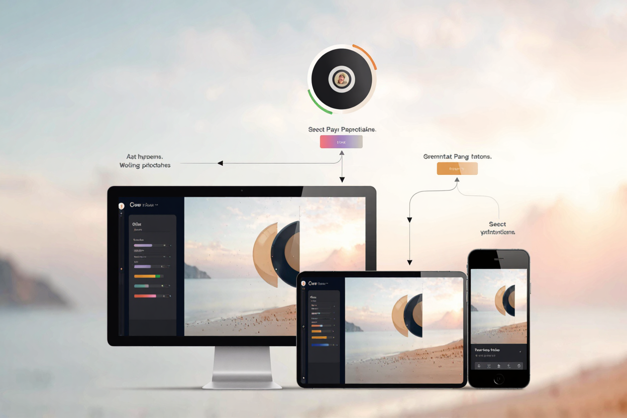
In today's multi-device world, delivering a seamless user experience is paramount. Images are often the heaviest elements on a webpage, and serving them inefficiently can significantly impact load times, user satisfaction, and even your search engine rankings. Responsive images are not just a best practice; they are a necessity.
This guide will dive deep into srcset and sizes, two powerful HTML attributes that empower browsers to choose the most appropriate image for each user's device and viewport. Mastering these tools ensures your website looks great and performs optimally, regardless of screen size or resolution.
The Challenge of Images on the Web
Imagine a high-resolution image designed for a large desktop monitor. If that same image is delivered to a small smartphone screen, it consumes unnecessary bandwidth, slowing down the page. Conversely, a low-resolution image stretched across a high-DPI (Retina) display will appear pixelated and blurry.
The goal is to serve an image that is just right: high enough resolution for clarity, but small enough in file size for fast loading. This is where responsive image techniques come into play, allowing you to provide multiple image versions and let the browser intelligently pick the best one.
Understanding srcset
The srcset attribute allows you to define a list of different image sources, each with its own intrinsic width or pixel density descriptor. Instead of a single src attribute, srcset offers a comma-separated list of image URLs, followed by a descriptor.
There are two main types of descriptors for srcset: width descriptors (w) and pixel density descriptors (x). Width descriptors tell the browser the actual width of the image file in pixels, while pixel density descriptors indicate the pixel density of the screen for which the image is intended (e.g., 1x, 2x).
Using w descriptors is generally recommended as it provides more flexibility and works better with the sizes attribute. For example, image-small.jpg 480w, image-medium.jpg 800w, image-large.jpg 1200w tells the browser that image-small.jpg is 480 pixels wide, and so on.
Understanding sizes
While srcset tells the browser about the available image files and their intrinsic widths, the sizes attribute informs the browser about how much space the image will occupy on the page at different viewport widths. This is crucial for the browser to make an informed decision.
The sizes attribute takes a comma-separated list of media conditions and a corresponding slot width. A media condition is similar to a CSS media query (e.g., (max-width: 600px)), and the slot width specifies the width the image will occupy when that condition is true (e.g., 100vw for 100% of viewport width).
For instance, sizes="(max-width: 600px) 100vw, (max-width: 1200px) 50vw, 800px" means: if the viewport is 600px or less, the image will take up 100% of the viewport width. If it's between 601px and 1200px, it will take up 50% of the viewport width. Otherwise, it will be 800px wide.
The Synergy of srcset and sizes
When srcset and sizes are used together, the browser performs a powerful calculation. It considers the user's viewport size, device pixel ratio, and the layout information provided by sizes to determine the most appropriate image from the srcset list.
The browser effectively calculates the