The rise of dark mode has dramatically shifted how users interact with websites, offering a comfortable viewing experience, especially in low-light conditions. While beneficial for readability and reducing eye strain, it introduces unique challenges for web developers and designers, particularly concerning image optimization. Ensuring your visuals look great in both light and dark themes is crucial for a consistent and professional user experience.
Why Dark Mode is Essential for Modern Websites
Dark mode isn't just a trend; it's a fundamental user preference driven by several factors. Many users find dark interfaces gentler on their eyes, reducing glare and digital eye strain during extended browsing sessions. It also contributes to better battery life on OLED screens, as dark pixels consume less power. Offering a dark mode option demonstrates a commitment to user comfort and accessibility.
Moreover, a well-implemented dark mode enhances the aesthetic appeal of a website, providing a sleek, modern look. It allows content to pop against a darker background, creating a distinct visual identity. Failing to optimize images for this environment can lead to jarring contrasts or invisible elements, detracting significantly from the user experience.
The Unique Challenges of Images in Dark Mode
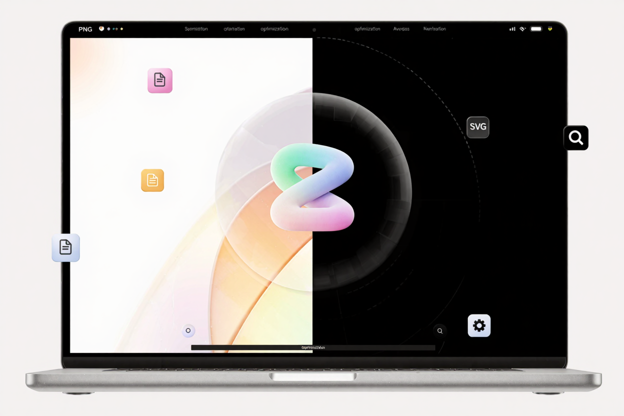
Images designed solely for light mode often present issues when viewed against a dark background. Logos with white backgrounds become unsightly white boxes, transparent PNGs might have subtle halos, and images with intricate details can lose clarity. The primary challenge lies in maintaining visual integrity and ensuring images blend seamlessly with both light and dark themes without requiring separate assets for every single image.
Another common problem is text embedded within images, which might become unreadable if its color doesn't contrast sufficiently with the new background. Furthermore, subtle shadows or highlights that work well in a light theme can appear out of place or even disappear in a dark one. Addressing these issues proactively is key to a truly adaptive design.
Key Strategies for Optimizing Images for Dark Mode
Optimizing images for dark mode involves a multi-faceted approach, combining design considerations with technical implementations. The goal is to create visuals that adapt gracefully, or to provide alternatives that ensure optimal display regardless of the user's preferred theme.
Leverage Transparent PNGs and SVGs
For logos, icons, and graphic elements, using images with transparent backgrounds is paramount. PNGs are excellent for raster graphics requiring transparency, allowing them to blend seamlessly with any background color. However, ensure these PNGs are fully optimized for web performance. You can easily compress your PNG files for free to maintain quality while reducing file size, ensuring fast loading times.
For vector graphics, Scalable Vector Graphics (SVGs) are the superior choice. SVGs are resolution-independent and can be styled with CSS, meaning you can dynamically change their colors to match the dark mode theme. This adaptability makes them ideal for UI elements, ensuring they always look sharp and integrate perfectly.
Utilize CSS Filters and Blend Modes
CSS offers powerful tools to adapt images without needing separate files. The filter property, particularly invert(), sepia(), or brightness(), can dynamically adjust the appearance of an image. While invert() can sometimes be too aggressive, a combination of filters can achieve a more balanced look for certain image types.
CSS mix-blend-mode can also be incredibly useful. For instance, mix-blend-mode: difference can create intriguing effects that adapt based on the background color. Experimenting with these properties can lead to surprising and effective solutions for adapting existing images without extensive redesign.
Implement the <picture> Element with prefers-color-scheme
For more complex scenarios where simple CSS adjustments aren't enough, the <picture> element provides a robust solution. This HTML element allows you to serve different image sources based on media queries, including the user's color scheme preference.
By using <source media="(prefers-color-scheme: dark)"> within your <picture> tag, you can specify an image optimized for dark mode. If the user's system is set to dark mode, the browser will load that specific image. Otherwise, it will fall back to the default image, typically optimized for light mode. This method offers precise control over image display for both themes.
Thorough Testing and Iteration
Regardless of the strategy employed, rigorous testing is indispensable. Always test your website in both light and dark modes across various browsers and devices. Pay close attention to how images interact with different background colors, ensuring readability, contrast, and visual harmony. Identify any images that look out of place or become difficult to discern.
Gather user feedback if possible, as real-world usage can reveal issues you might have overlooked. Iteration is key; be prepared to refine your image assets or CSS rules based on your testing results to achieve the best possible user experience.
Practical Tips for Image Optimization
Beyond specific dark mode strategies, general image optimization practices remain crucial. Always aim for the smallest possible file size without compromising visual quality. Large images slow down your website, impacting user experience and SEO.
Before uploading, ensure your images are properly sized and compressed. For PNG files, a reliable PNG optimization tool can drastically reduce file sizes, making your site load faster. Remember to optimize all image types, including JPEGs and SVGs, for web delivery.
Sometimes, you might encounter images in less common formats like HEIC. If you need to use these on your website, convert them to more web-friendly formats such as PNG or JPEG. A <a href="https://convertminify.com/tools/heic-to-png" target="_blank" rel="noopener noreferrer">HEIC to PNG Converter</a> can be incredibly useful for this purpose, ensuring compatibility and allowing further optimization. You can always compress your PNG files for free after conversion to ensure maximum efficiency.
FAQ
How do I ensure my logo looks good in dark mode?
For logos, always use a transparent PNG or an SVG. If your logo has white elements that disappear in dark mode, consider creating a dark mode specific version of your logo with lighter elements, and use the <picture> element to serve it based on the user's prefers-color-scheme.
Can I automate image optimization for dark mode?
While some dynamic adjustments like CSS filters can be automated, fully optimizing images for dark mode often requires a combination of manual design choices and automated tools. Using a build process that generates dark mode specific assets or applies CSS rules based on themes can streamline the workflow.
What's the best image format for dark mode?
Transparent PNGs are excellent for raster graphics that need to blend, and SVGs are ideal for vector graphics due to their scalability and CSS styling capabilities. For photographic images, JPEGs are generally preferred, but you might need to adjust their brightness or contrast, or provide dark mode specific versions using the <picture> element.
Optimizing images for dark mode is an essential step in creating a truly modern and user-friendly website. By carefully considering transparency, contrast, and performance, you can ensure your visuals shine, regardless of the user's preferred viewing theme. Start implementing these strategies today to enhance your website's accessibility and aesthetic appeal.