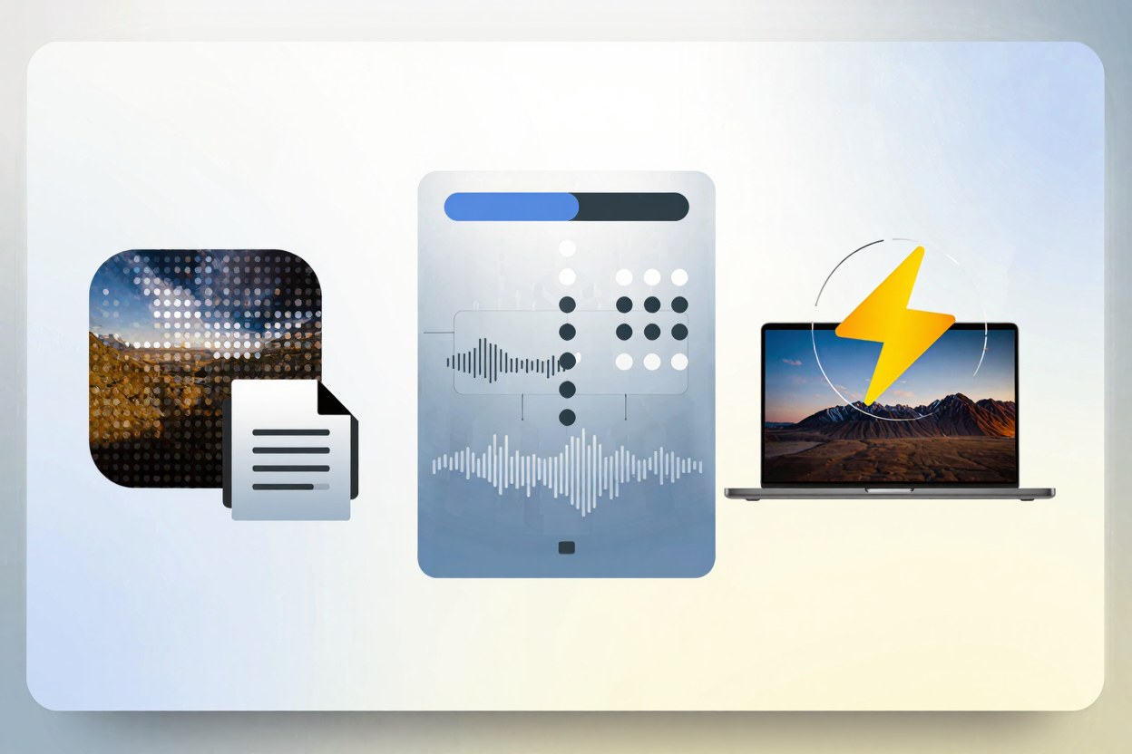
High-DPI images offer stunning visual clarity, making websites look incredibly sharp on modern displays like Retina screens. However, this visual fidelity often comes at a significant cost: larger file sizes. These larger files can dramatically slow down your website, leading to poor user experience, increased bounce rates, and even negative impacts on your search engine rankings.
Understanding how to manage these high-resolution assets is crucial for maintaining both visual quality and peak website performance. This guide will explore effective strategies to handle high-DPI images, ensuring your site remains fast, responsive, and visually impressive.
What are High-DPI Images?
High-DPI (Dots Per Inch) or Retina images refer to images with a higher pixel density than standard displays. This means they pack more pixels into the same physical space, resulting in sharper, more detailed visuals. While aesthetically pleasing, this increased pixel count directly translates to larger file sizes, posing a challenge for web performance.
Why High-DPI Images are a Challenge for Performance
The primary issue with high-DPI images is their file size. A single high-resolution image can easily be several megabytes, leading to longer page load times. This impacts user experience, especially for those on slower internet connections or mobile devices.
Slow loading times also negatively affect SEO, as search engines favor fast-loading websites. Balancing visual quality with performance is therefore essential for a successful online presence.
Strategies for Handling High-DPI Images
Fortunately, several techniques can help you deliver crisp high-DPI images without compromising your website's speed.
1. Implement Responsive Images with srcset and sizes
Responsive images allow browsers to choose the most appropriate image resolution based on the user's device, screen size, and pixel density. By using the srcset and sizes attributes in your <img> tags, you can provide multiple versions of an image.
The browser then intelligently selects the optimal image, serving smaller files to lower-resolution screens and higher-DPI versions only when needed. This ensures users receive the best possible image quality for their device without downloading unnecessary data.
2. Optimize and Compress Your Images
One of the most effective ways to combat large file sizes is through robust image optimization. This involves reducing file size without noticeable degradation in visual quality. For PNG files, which are often used for graphics with transparency, this is particularly important. You can easily compress your PNG files for free using a dedicated tool.
Optimization can be achieved through various methods, including lossy and lossless compression. Lossless compression reduces file size without discarding any data, while lossy compression achieves greater reductions by removing some data, often imperceptible to the human eye. Beyond basic compression, converting images to modern formats like WebP or AVIF can yield significant savings. However, for existing PNG assets, a specialized PNG optimization tool remains invaluable.
3. Utilize Lazy Loading
Lazy loading defers the loading of images until they are actually needed, typically when they enter the user's viewport. Instead of loading all images on a page at once, only those visible initially are loaded.
As the user scrolls down, more images are loaded just before they become visible. This technique significantly reduces initial page load times, improving perceived performance and conserving bandwidth, especially on pages with many images.
4. Leverage Content Delivery Networks (CDNs)
CDNs are networks of servers distributed globally. When you use a CDN for your images, users are served images from the server geographically closest to them. This reduces latency and speeds up image delivery.
CDNs also often include optimization features, such as automatic image compression and format conversion, further enhancing performance. They are an excellent solution for websites with a global audience or a large volume of media content.
5. Employ Vector Graphics for Logos and Icons
For elements like logos, icons, and simple illustrations, Scalable Vector Graphics (SVGs) are an ideal solution. Unlike raster images (like PNGs or JPEGs) which are pixel-based, SVGs are XML-based and define graphics using mathematical equations.
This means SVGs can scale to any size without losing quality or becoming pixelated, and their file sizes are typically very small. They are perfect for high-DPI displays as they always render perfectly sharp, regardless of resolution.
The Role of Compression in High-DPI Management
Effective compression is not just about making files smaller; it's about delivering a faster, smoother experience for your users. Especially for high-DPI images, where raw file sizes can be enormous, smart compression becomes non-negotiable. It bridges the gap between stunning visuals and blazing-fast load times.
While focusing on web images, it’s worth noting that other large media files, like PDFs, can also impact overall site performance if linked directly. For such cases, consider a tool to <a href="https://pdfalone.com/tools/compress-pdf" target="_blank" rel="noopener noreferrer">Compress PDF</a> files to ensure all aspects of your content delivery are optimized.
Practical Steps with PNGMinify
PNGMinify simplifies this process, allowing you to quickly reduce the size of your high-DPI PNGs without compromising their quality, ensuring your site remains swift and responsive. With its intuitive interface, you can upload your images and get optimized versions in moments, making it an indispensable tool for any webmaster or designer.
Don't let large image files slow you down; compress your PNG files for free and enhance your website's performance today.
FAQ
What is the biggest challenge when using high-DPI images on a website?
The biggest challenge is managing their significantly larger file sizes, which can lead to slow page load times, poor user experience, and negative impacts on SEO if not properly optimized.
Can I use a single high-DPI image for all devices to simplify my workflow?
While technically possible, it's not recommended for performance. Serving a single large high-DPI image to all users, regardless of their device, means many users will download unnecessarily large files. Responsive image techniques are far more efficient.
Does image compression always reduce visual quality?
Not necessarily. Lossless compression methods reduce file size without any loss of quality. Lossy compression, while achieving greater reductions, is designed to remove data that is least perceptible to the human eye, often resulting in negligible visual changes while significantly shrinking file size.
Start optimizing your high-DPI images today to ensure your website delivers both stunning visuals and lightning-fast performance. A faster site means happier users and better search engine rankings.